
As much as we hate to admit it, most college teams aren’t competing for a national championship. So instead, the games are about energy, fun and school pride. And what better way to represent those three things than an undeniably cool logo?
Colleges shuffle through logos like playing cards, and many institutions have been around for hundreds of years – so they’ve seen their fair share of iterations. Along the way, there have been some forgotten gems that simply must be resurfaced.
Here are five retired college logos that deserve their jobs back.
Central Florida’s Citronaut
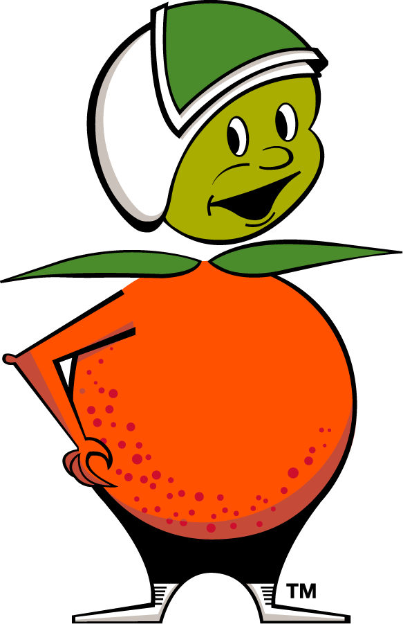
Debuting in 1968 to honor two of Florida’s most promising industries – citrus and aerospace – the Citronaut was never an official mascot of UCF (originally Florida Technological University), but was on the cover of the school’s first student handbook.
On one hand, you have oranges – delicious. On the other hand, you have astronauts – super cool. Now, hear me out … put your hands together. Congratulations, you’ve just formed arguably the best logo in college sports history, the Citronaut.
Norman Van Meter initially designed the logo “more or less as a joke,” according to a January, 1969 edition of FTU’s “Central Florida Future,” but the Citronaut’s lovable likeness has been lodged in the hearts of the UCF faithful for going on 60 years.
I mean, look at this little guy. Not exactly the most intimidating visage, but it’s extremely unique and fits in perfectly with the modern retro-futuristic aesthetic. You could easily see this in an episode of “Fallout” on a tin can of peaches or something.
It’s no wonder UCF has embraced the Citronaut, occasionally using the throwback logo on baseball uniforms over the past decade.
Iowa State’s Whirlybird
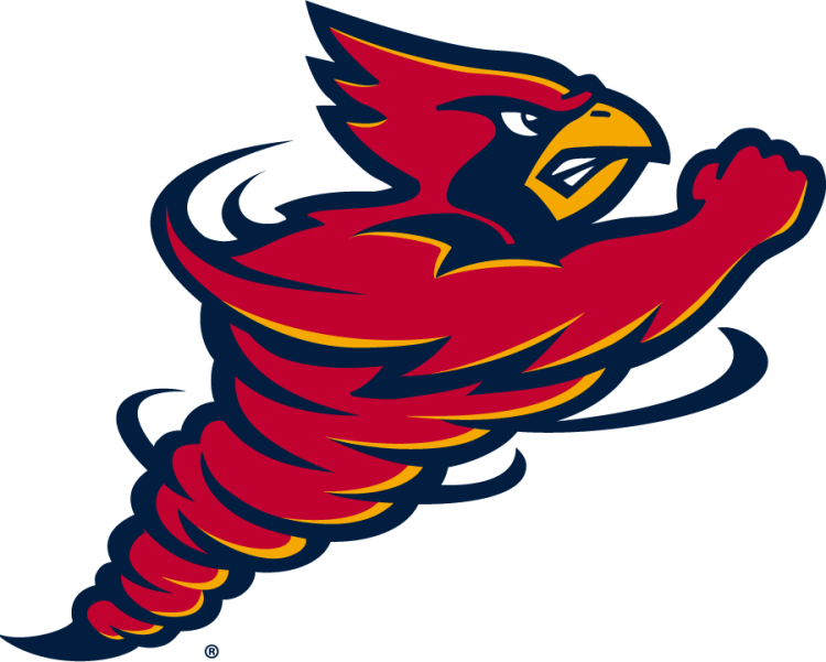
Whirlybird. Cynado. Bird in a Blender. You know a logo is beloved when the fanbase clamors so vociferously that the school actually brings it back. That’s what Iowa State did with its Whirlybird logo, reviving an updated version in 2025.
I’m a sucker for an anthropomorphic mascot, and Cy – the masterful half-cardinal, half-cyclone hybrid with the biceps of Arnold Schwarzenegger – is the perfect representation of Iowa State. Unfortunately Cy was put on the backburner for the 2008-09 season, but the reasoning was actually pretty sound.
The athletic director at the time, Jamie Pollard, claimed that coaches were having trouble establishing brand identity with the logo. Some recruits thought it represented Louisville, due to the cardinal, while others confused the “ISU” for Illinois State University, whose mascot also happens to be a red bird. As a result, Iowa State implemented the more identifiable, prominent “I” with “STATE” pasted across it.
However, thanks to the persistence of Iowa State fans, the school brought back Cynado in November 2025, for the football team’s Senior Day battle against Kansas. The logo’s revival was naturally a rousing success, as Iowa State clobbered the Jayhawks, 38-14, and it is still used as an alternate helmet design.
Oregon State’s Benny Beaver
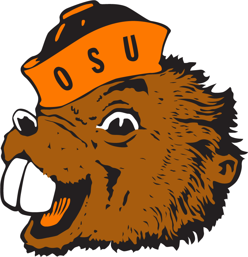
Designed by Arthur Evans and approved by Oregon State College in 1951, the original Benny Beaver made a lasting impression with his pearly buck teeth, mischievous grin and Beaver Orange sailor’s cap.
Perhaps a bit too cartoonish, Benny was redesigned by Nike in 2013 to look more sleek and fierce. But, as we’ve seen with so many logos, nostalgia always wins.
In the fall of 2018, OSU brought back the original Benny, justly dubbing it, “the return of an icon.” It was just the second time that Benny appeared on OSU’s helmets, with the other occurring in 1973.
“Retro Benny is a cherished emotional connection by generations of Beaver Nation, and our student-athletes, coaches and staff are excited to represent the rich history of this university on a national stage,” then-OSU vice president and director of athletics Scott Barnes said at the time.
It’s about time Benny got back his full-time gig.
Tulane’s Greenie
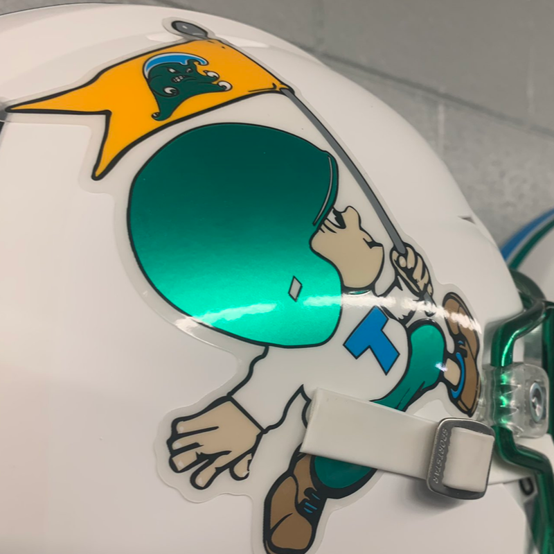
Everyone loves an underdog, and it’s simply impossible to root against a small child clad in oversized football gear. Certainly the most adorable logo on this list, and perhaps in college sports history, Greenie served as Tulane’s logo from 1945 until the Angry Wave took over in 1964.
Created by John Churchill Chase, the best part about Greenie is that he is basically a cartoon character, able to be illustrated into comical situations with other schools’ mascots – shaving “Tulane” into the fur of a Baylor Bear, swatting a Georgia Tech Yellow Jacket to a sticky mat or taking the stripes off LSU’s Mike the Tiger. The possibilities are endless.
Tulane brought Greenie out of retirement for its September 2021 football game against Ole Miss, but unfortunately the logo’s power wasn’t strong enough in a 61-21 loss.
Georgia’s Bulldog Head
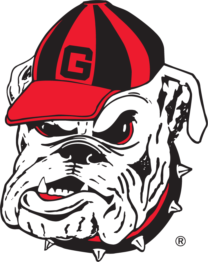
It’s hard to understand this trend of using capital letters in logos instead of intimidating animals. Georgia might be the best example, as this bulldog head with red and black accents might be the most genuinely terrifying we’ve seen. The red eyes. The canines menacingly protruding from the mouth. The spiky collar. The off-kilter cap. If I see this, I want nothing to do with Georgia athletes.
And yet, this logo was only around from 1958-1964 before being replaced by the trademark oval “G.” The head coach at the time, Vince Dooley, redesigned the uniforms himself, and the forward-looking “G” has stood the test of time.
But, after looking at that bulldog logo, I think we can agree that it’s time to go back.
As Morgan Blake of the Atlanta Journal wrote in 1920, “There is a certain dignity about a bulldog, as well as ferocity.”
Well said, Mr. Blake. Well said.
Colin Ward-Henninger is a content specialist working with McClatchy’s Content Innovation Lab.